Introducing the 2016 Color(s) of the Year
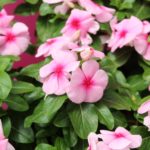
Last week, Pantone announced that the combination of Pantone 15-3919 Serenity and Pantone 13-1520 Rose Quartz are the Pantone Color of the Year selection for 2016.
According to the global color authority “the color is a harmonious pairing of inviting shades that embody a mindset of tranquility and inner peace.”
This is the first time ever that Pantone has selected the blending of two shades for its Color of the Year.
“With the whole greater than its individual parts, joined together Serenity and Rose Quartz demonstrate an inherent balance between a warmer embracing rose tone and the cooler tranquil blue, reflecting connection and wellness as well as a soothing sense of order and peace,” said Leatrice Eiseman, executive director of the Pantone Color Institute.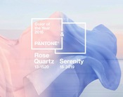
Pantone says Serenity and Rose quartz help consumers who seek mindfulness and well-being as an antidote to the stress of modern day lives. They are welcoming colors that “psychologically fulfill the yearning for reassurance.”
Pantone’s experts describe the Serenity as “weightless and airy, like the expanse of the blue sky, Serenity comforts with a calming effect, bringing feelings of respite and relaxation even in turbulent times. Rose Quartz is a persuasive yet gentle tone that conveys compassion and a sense of composure.”
What do you think of Pantone’s 2016 selection? How does it fit into your plans for next year? Drop me a line at thodson@greatamericanpublish.com and let me know.
You can find more information on the Pantone Color of the Year at www.pantone.com.

 Video Library