Pantone Announces This Year’s Color Trends
Pantone, known as a world leader of the color and design industries, recently released its yearly PANTONE Fashion Report. According to the report, fall ’08 – which will be defined in part by the hotly contested upcoming presidential election – will be best described as a season of change, and its palette will be defined by rich, elegant hues. New York’s fashion designers emphasize cooler blues, greens and purples in the top five tones used in their collections, followed by variations of warm red, orange and yellow.
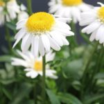
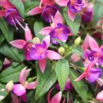
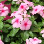
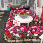
Color trends affect consumers on all levels, not just in the clothing items they purchase. The hues of the moment may inspire how they decorate their homes and what they want to see when they look out the window – it could even impact their choice of bedding plants, flowering shrubs or even the containers they purchase.
The top 10 fall ’08 colors are:
- Blue Iris (PANTONE 18-3943)
- Royal Lilac (PANTONE 18-3531)
- Shady Glade (PANTONE 18-5624)
- Caribbean Sea (PANTONE 18-4525)
- Aurora Red (PANTONE 18-1550)
- Shitake (PANTONE 18-1015)
- Withered Rose (PANTONE 18-1435)
- Twilight Blue (PANTONE 19-3938)
- Burnt Orange (PANTONE 16-1448)
- Ochre (PANTONE 14-1036)
Here are a few more details on the colors in the top 10, according to the Pantone press release:
Blue Iris, a beautifully balanced blue with an undertone of purple, is a favorite among designers, as it combines the calming aspects of blue with the mystical and spiritual qualities of purple. Dramatic Royal Lilac brings purple to the forefront of fashion and generates a bit of heat with its exciting red undertones.
Serene, sophisticated Caribbean Blue is another popular hue this fall, especially in jewelry and accessories, but it can also add a colorful intensity wherever it is used in the wardrobe. Twilight Blue, a twist on a classic navy, shows the transitional aspect of spring segueing into fall.
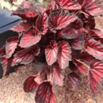
Serving as a wonderful base color, Shady Glade delivers a natural elegance to the fall palette. Taking green in an interesting direction with its true green characteristics, this hue is a departure from greens of seasons past, which have had distinctively yellow undertones.
Reds are a steadfast favorite for fall, and Aurora Red is no exception. Versatile and universally appealing, this true red adds a splash of energy to the palette. Soft, dusky Withered Rose, with its pinkish qualities and brown undertones, is a versatile hue that blends with every shade. Ochre, a beautifully mellow yellow with a hint of mustard, adds a touch of lightness and spice. Orange has had a long run, and now, more than ever, consumers are gravitating toward intense shades like Burnt Orange, bringing this once steady background color to the foreground. The complex yet modest Shitake is an intriguingly understated shade.
For more information on Pantone colors, visit the company’s website.
 Video Library